
Rooted for the Journey
Rooted for the Journey explored a quieter and more reflective interpretation of the Roots Canada brand through environmental storytelling, editorial pacing, and tactile visual systems. Inspired by Canadian landscapes, travel, and heritage craftsmanship, the campaign combined restrained typography, atmospheric imagery, and material-driven design into a cohesive lifestyle narrative.
Context
Editorial Branding + Brand Strategy Concept
Role
Brand Designer + Art Direction
Timeline
Brand Management Concept Study · 2025
Collaborators
Brand Management Concept Study

A quieter campaign direction inspired by reflection, Canadian landscapes, and emotionally grounded storytelling.

Typography, colour, material textures, and photography direction were designed to create a more restrained and tactile lifestyle identity.

Large-scale campaign applications emphasized atmosphere and emotional pacing over promotional messaging.

The collection system explored how material storytelling and seasonal environments could shape product narrative and campaign direction.

Retail environments extended the campaign through tactile materials, slower pacing, and environmental storytelling.

The positioning framework centered around comfort, heritage craftsmanship, and reconnection through everyday experiences.

The concept repositioned Roots through quieter emotional storytelling, modernized heritage cues, and a more grounded visual language.
Challenge
Lifestyle branding often relies heavily on trend-driven visuals and high-volume campaign production, making it difficult to create emotional longevity or a strong sense of place. The project explored how a more restrained and editorial approach could create deeper connections through atmosphere, materiality, pacing, and environmental storytelling rooted in Canadian identity and travel culture.
Approach
The project approached the campaign as an editorial lifestyle system centered around reflection, comfort, and environmental connection. Typography, photography direction, colour palettes, and campaign pacing were intentionally restrained to create a quieter visual language inspired by heritage craftsmanship and outdoor exploration. Rather than relying on overt promotional energy, the work emphasized mood, texture, and narrative continuity across campaign environments and branded touchpoints.
System
Editorial Campaign Systems
Environmental Storytelling
Lifestyle Brand Direction
Material-Driven Design
Visual Narrative Frameworks
Deliverables
Campaign Concepts
Editorial Art Direction
Billboard Applications
Packaging Concepts
Retail Touchpoints
Visual Direction Boards
Capabilities
Art Direction
Editorial Branding
Campaign Systems
Environmental Storytelling
Visual Narrative Design
Outcome
The final concept created a more atmospheric and emotionally grounded interpretation of the Roots Canada brand through slower editorial pacing, tactile visual systems, and landscape-driven storytelling. The campaign demonstrated how restraint and material sensitivity can create stronger emotional resonance across lifestyle branding environments.
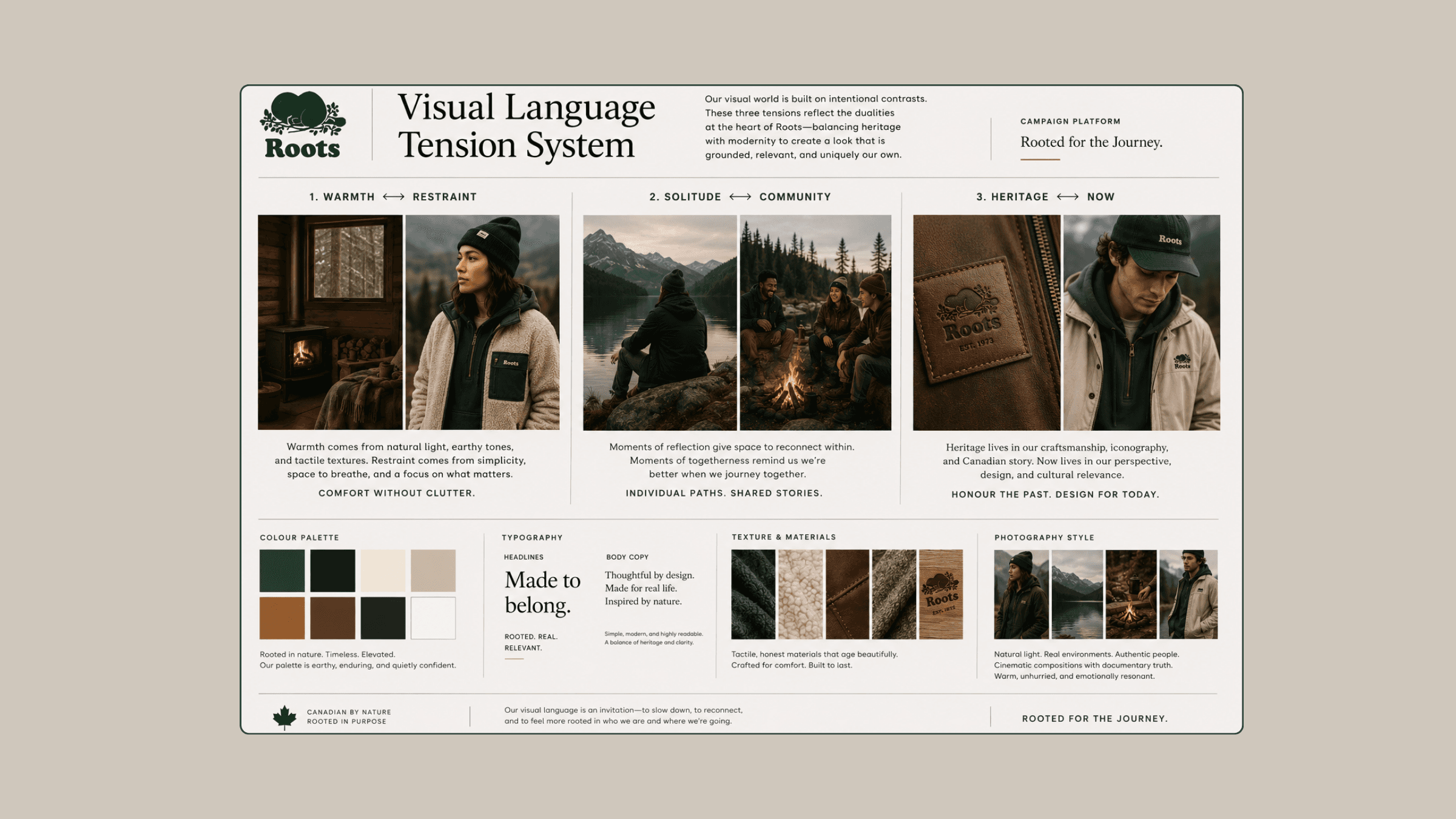
The visual system balanced warmth and restraint, solitude and community, and heritage with modern lifestyle storytelling.

Campaign applications extended across outdoor, social, retail, and digital environments through one connected narrative system.

The final system explored how language, pacing, and visual atmosphere could work together to create a more emotionally resonant lifestyle brand.
Reflection
The project reinforced how much emotional tone can be created through restraint rather than visual excess. By focusing on pacing, atmosphere, texture, and environmental storytelling, the work explored how lifestyle campaigns can communicate identity and belonging through quieter, more reflective experiences.